Nosso Sabor
Brand Identity
2024
Tubarão, SC
Nosso Sabor is an artisanal ice cream shop that transforms every moment into a sweet and unforgettable experience. With a unique concept, the brand combines authentic, creamy flavors with a playful and charming design.
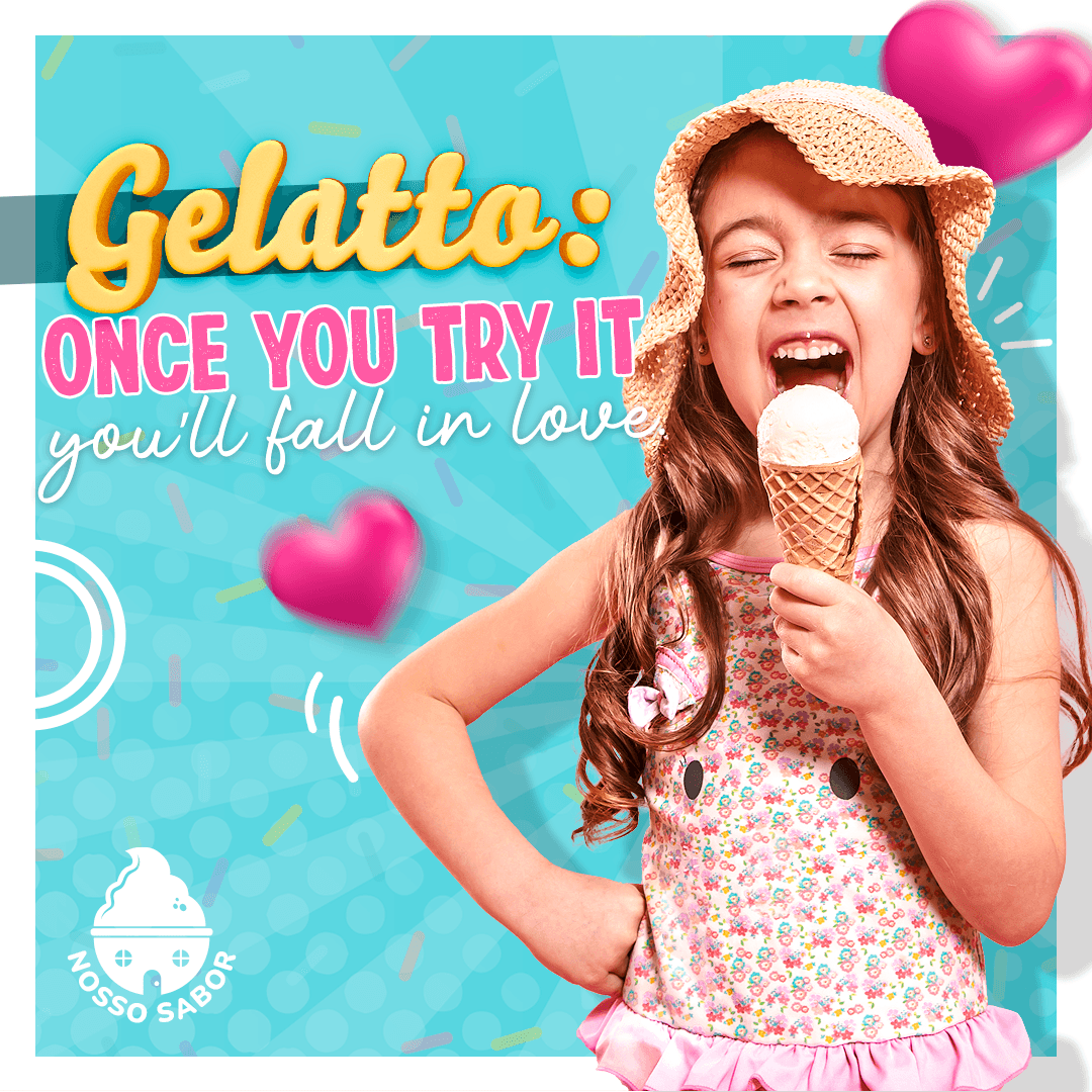
Nosso Sabor targets families, young adults, and children who enjoy sweet, fun, and visually appealing treats. The brand aims to create a joyful and inviting atmosphere that celebrates moments and the simple pleasure of enjoying high-quality ice cream. The visuals convey excitement, indulgence, and a playful experience, aligning with the target audience's love for vibrant and engaging content.
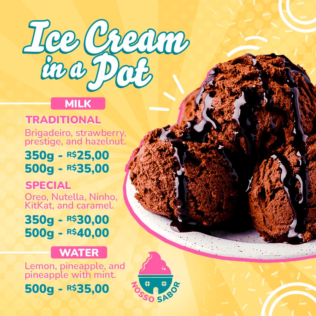
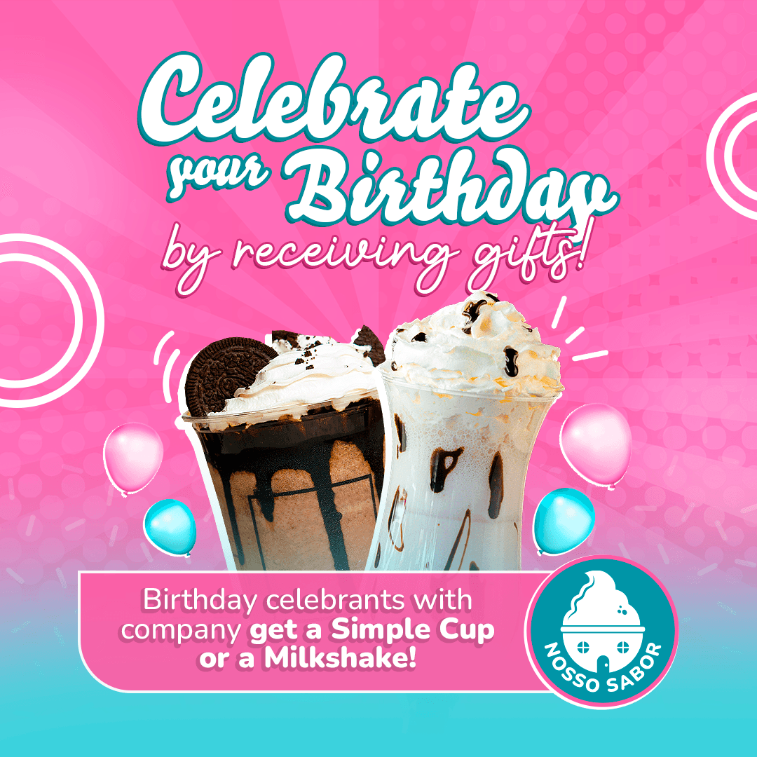
To achieve this, I used bright colors, rounded shapes, and dynamic typography to evoke energy and fun. The backgrounds feature radial patterns and floating elements, adding movement and a sense of celebration. The mix of handwritten and bold fonts enhances the friendly and inviting feel, while the images of ice cream and smiling faces strengthen the emotional connection. The carefully selected color palette ensures consistency with the brand identity, reinforcing a cheerful and cohesive visual language.
|
Nosso
Sabor
Social Design
2024
Tubarão, SC
Nosso Sabor is an artisanal ice cream shop that transforms every moment into a sweet and unforgettable experience. With a unique concept, the brand combines authentic, creamy flavors with a playful and charming design.
Nosso Sabor
Social Design
2024
Tubarão, SC
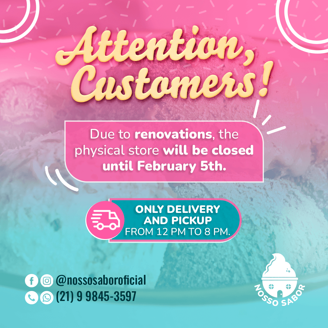
Nosso Sabor is an artisanal ice cream shop that transforms every moment into a sweet and unforgettable experience. With a unique concept, the brand combines authentic, creamy flavors with a playful and charming design.
Nosso Sabor targets families, young adults, and children who enjoy sweet, fun, and visually appealing treats. The brand aims to create a joyful and inviting atmosphere that celebrates moments and the simple pleasure of enjoying high-quality ice cream. The visuals convey excitement, indulgence, and a playful experience, aligning with the target audience's love for vibrant and engaging content.
To achieve this, I used bright colors, rounded shapes, and dynamic typography to evoke energy and fun. The backgrounds feature radial patterns and floating elements, adding movement and a sense of celebration. The mix of handwritten and bold fonts enhances the friendly and inviting feel, while the images of ice cream and smiling faces strengthen the emotional connection. The carefully selected color palette ensures consistency with the brand identity, reinforcing a cheerful and cohesive visual language.